Rocko, formerly Mango HR is an excellent HR and people management company in Chepstow who have a niche in the creative and tech sectors.
Mango HR has a fun culture, building strength and unity within their team, making them an ideal choice to work with.
The rebrand was required to ready them for a leap in the size of clients they are able to work with and want to target/reach. It had to represent a more mature outlook on their business, to show that they are professional in their approach and knowledge they possess but they are still fun to work with.
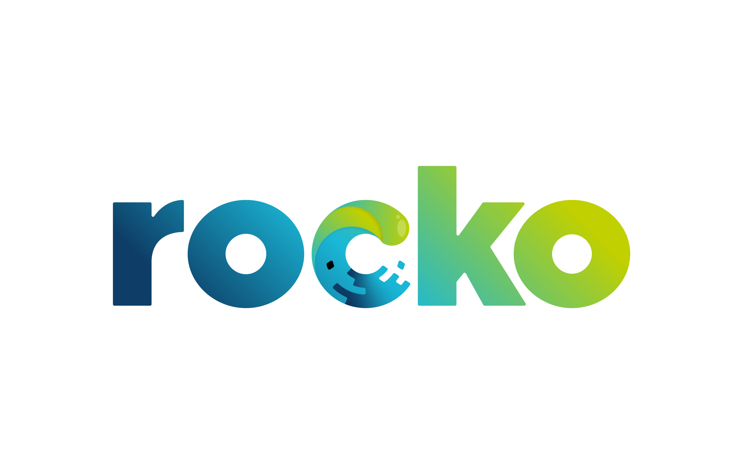
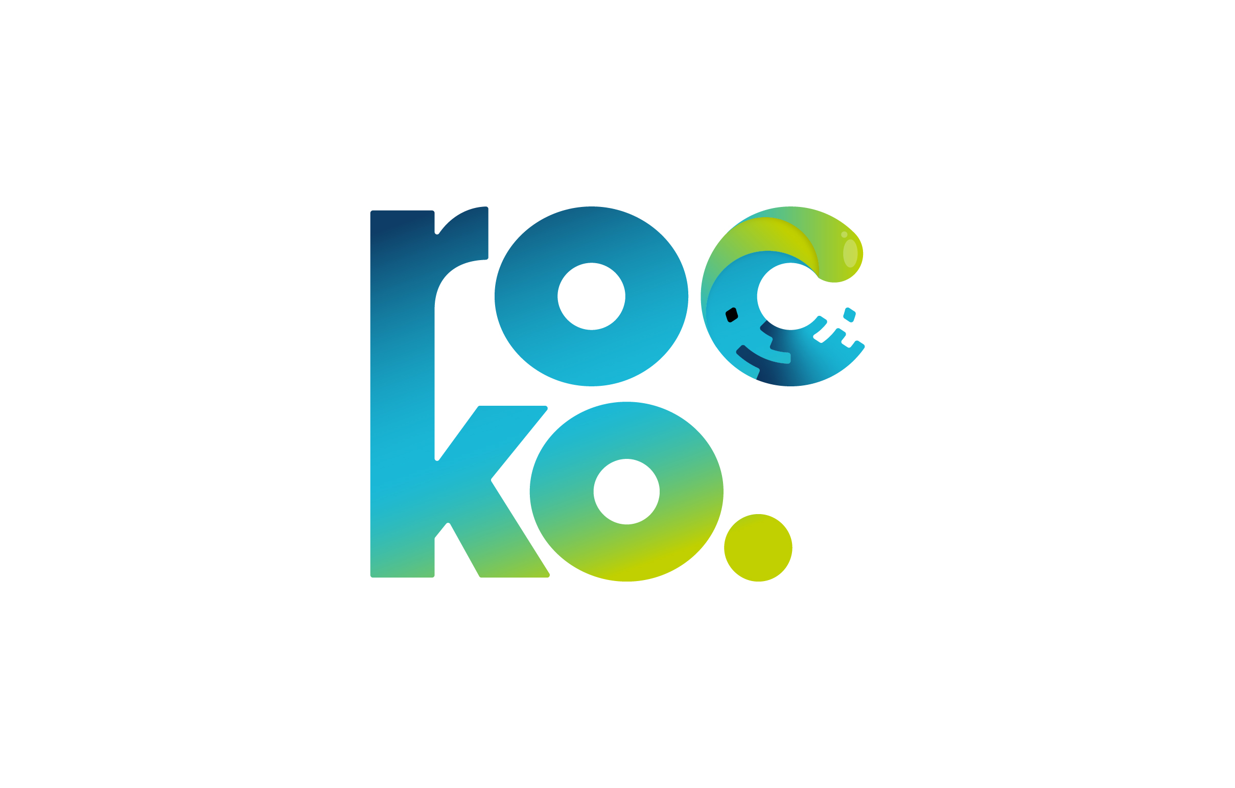
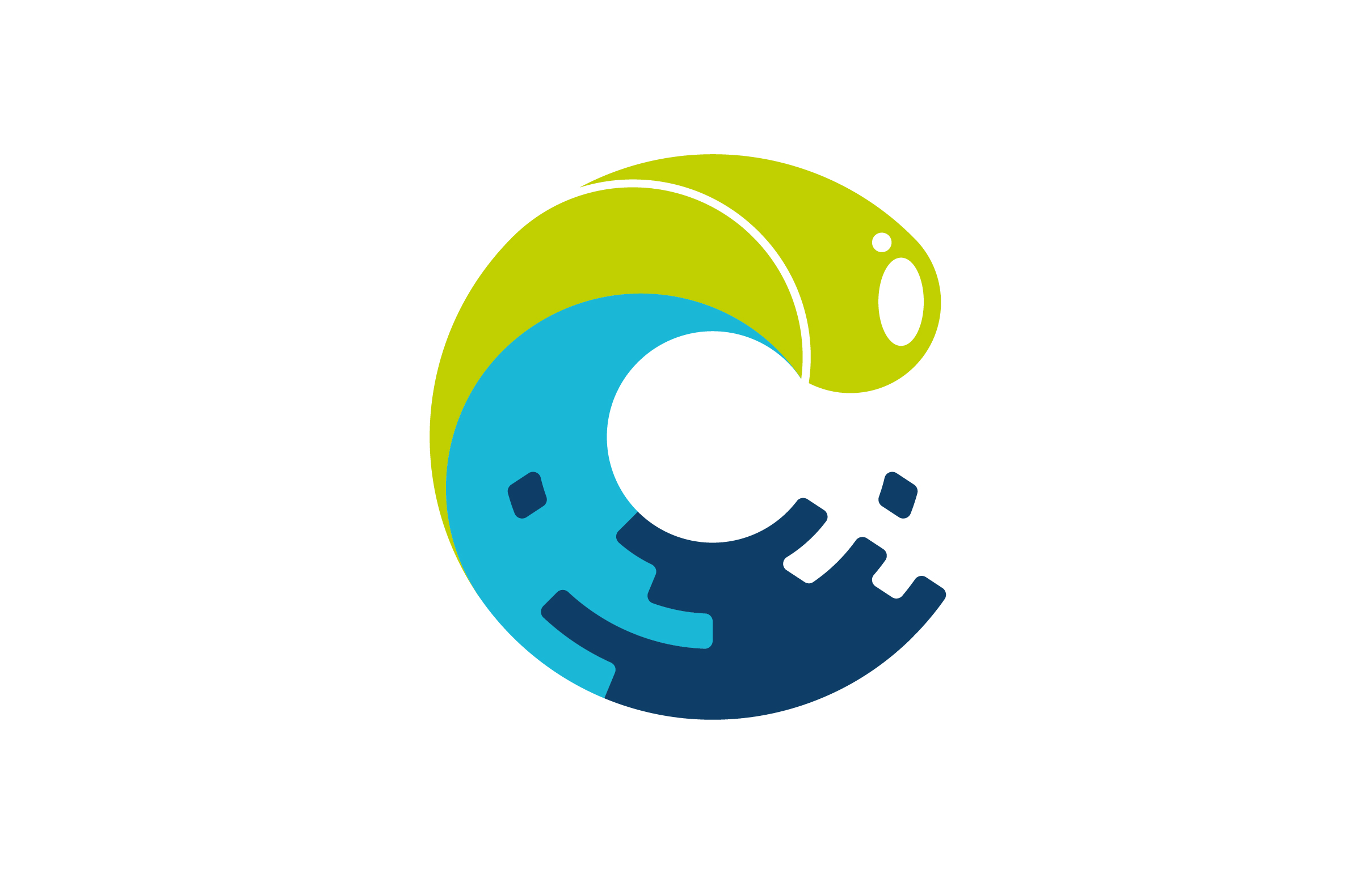
The name Rocko is a culmination of elements ranging from the interests of the business owners, a good component to help a business owner build a stronger relationship with their business. They love to surf and the tip of a surfboard is called the ‘Rocker’. The values they have about taking care of the smaller businesses/clients as they form the foundations of your business and a values system they operate to called the Rockefeller rules to running a business.
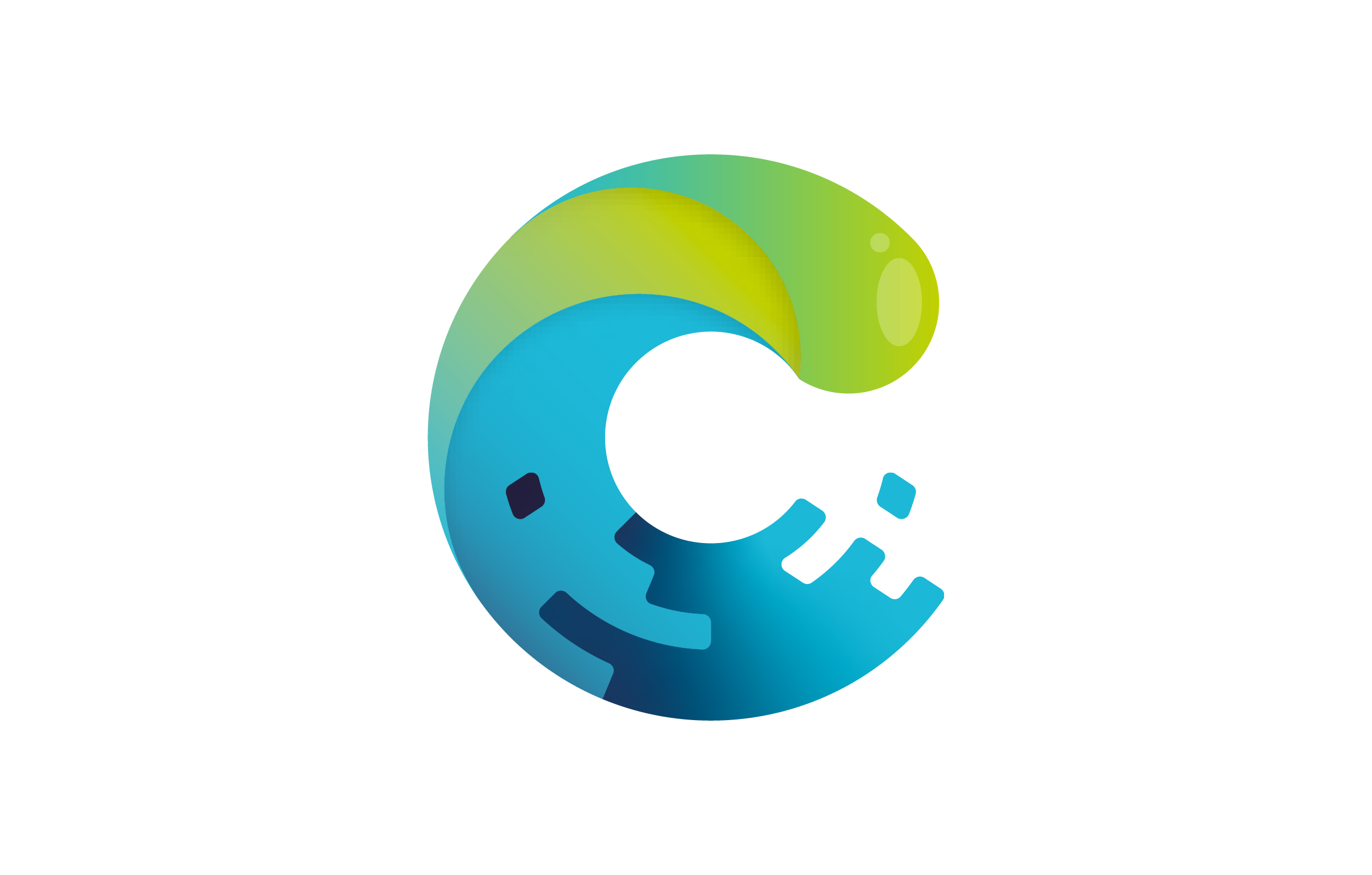
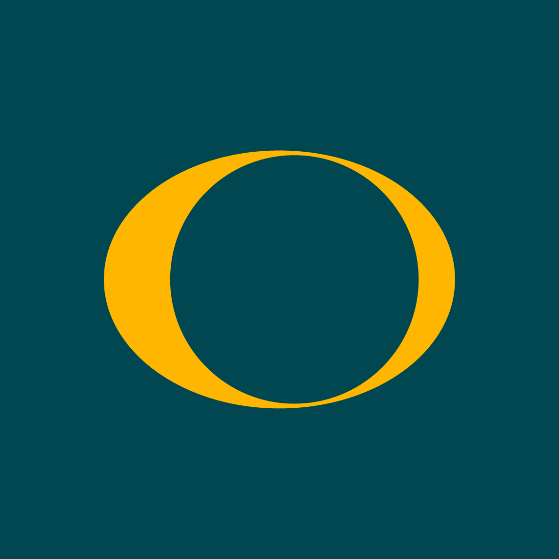
The form of the logo has a clear connection to water or waves. The theme of a wave, when broken down further, reinforces the use of this symbology, especially when connected to the Rocko value of taking care of your small clients because they are your foundation.
The more smaller clients you have a business will build (like a wave) and then larger clients with planning and productivity will push your business to new heights.
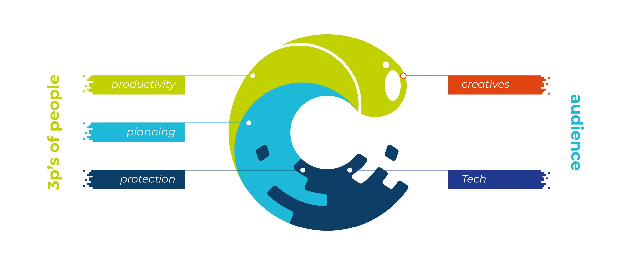
The logo is built to represent what they call, the 3P’s of people, Planning, Protection and Productivity as well as appealing to the two main audiences they have, creatives and tech.
The 3P’s are catered for in the colour scheme, the audience in the appearance. The top of the wave looking shiny and fluid for the creatives and the bottom level pixelated for the tech audience.
This brand was a joy to work on with such a passionate and driven team of fun, professionals.