Branding

BUILD MY TALENT

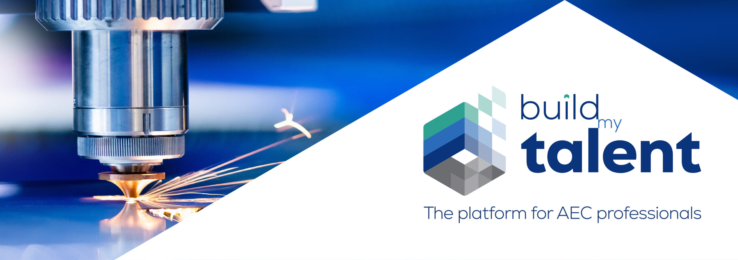
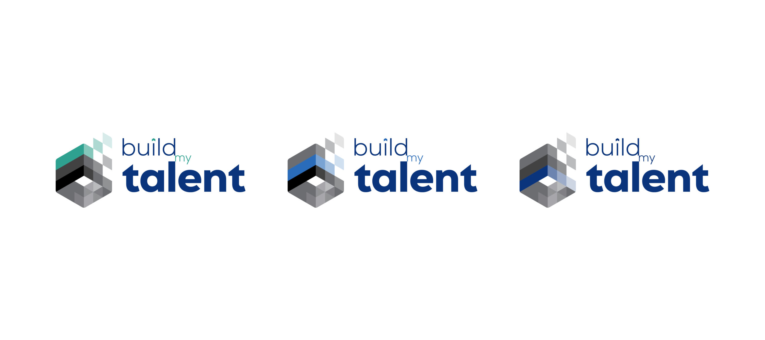
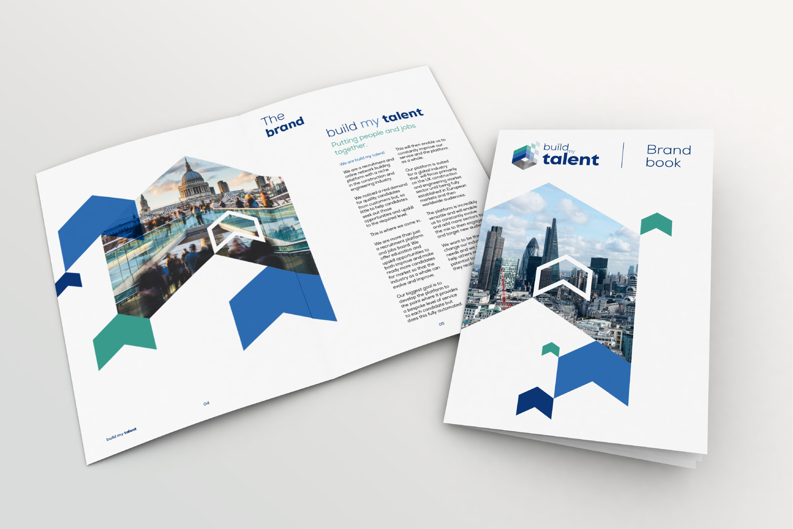
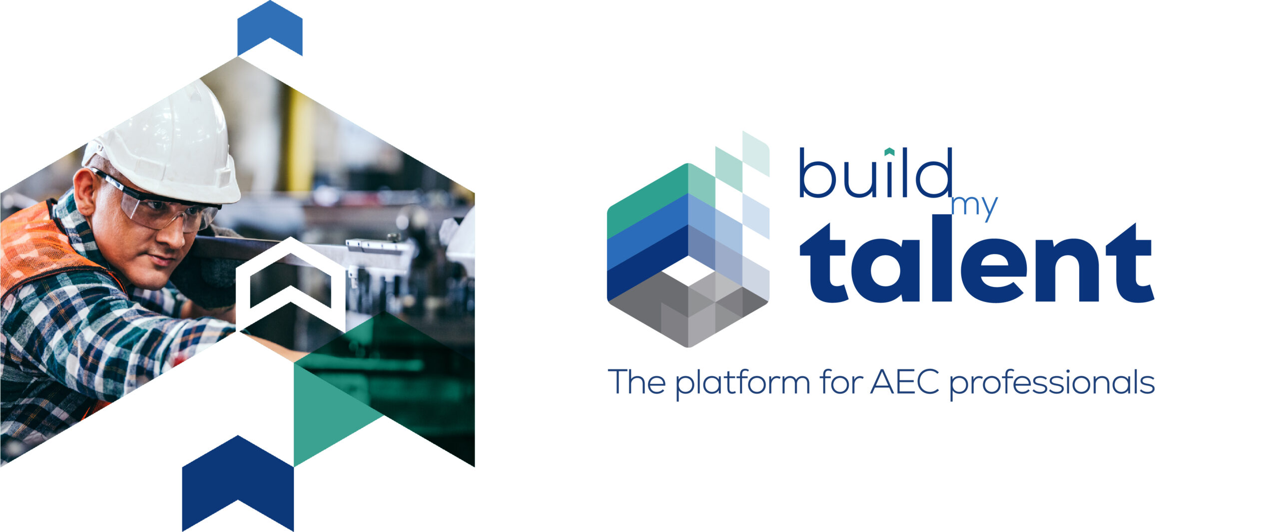
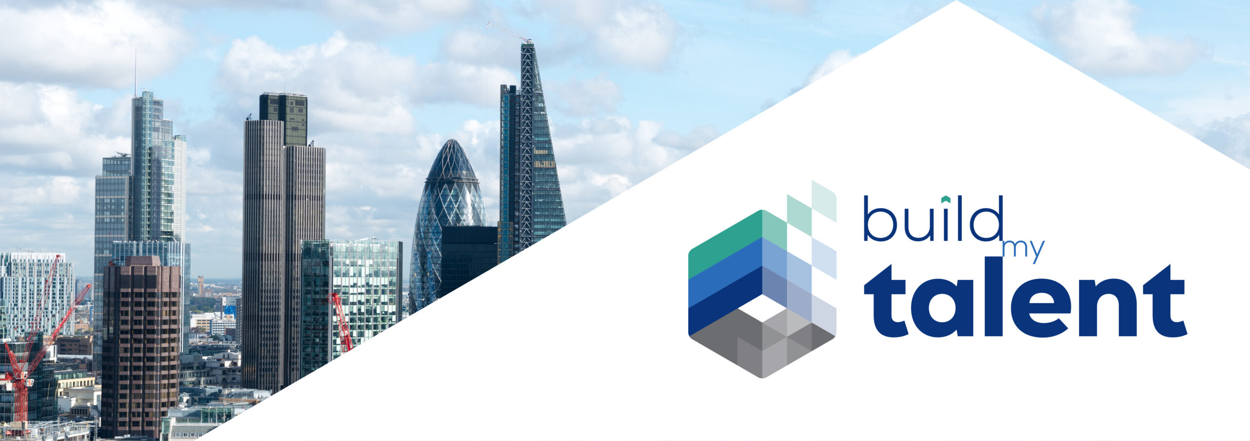
BUILD MY TALENT (BMT) is a recruitment and online network building platform with a niche in the construction and engineering industry.

With growth plans in motion, over the next 3 years BMT are aiming to create a platform for a global industry that will focus primarily on the UK construction and engineering market sector in order to perfect their platform and structure.

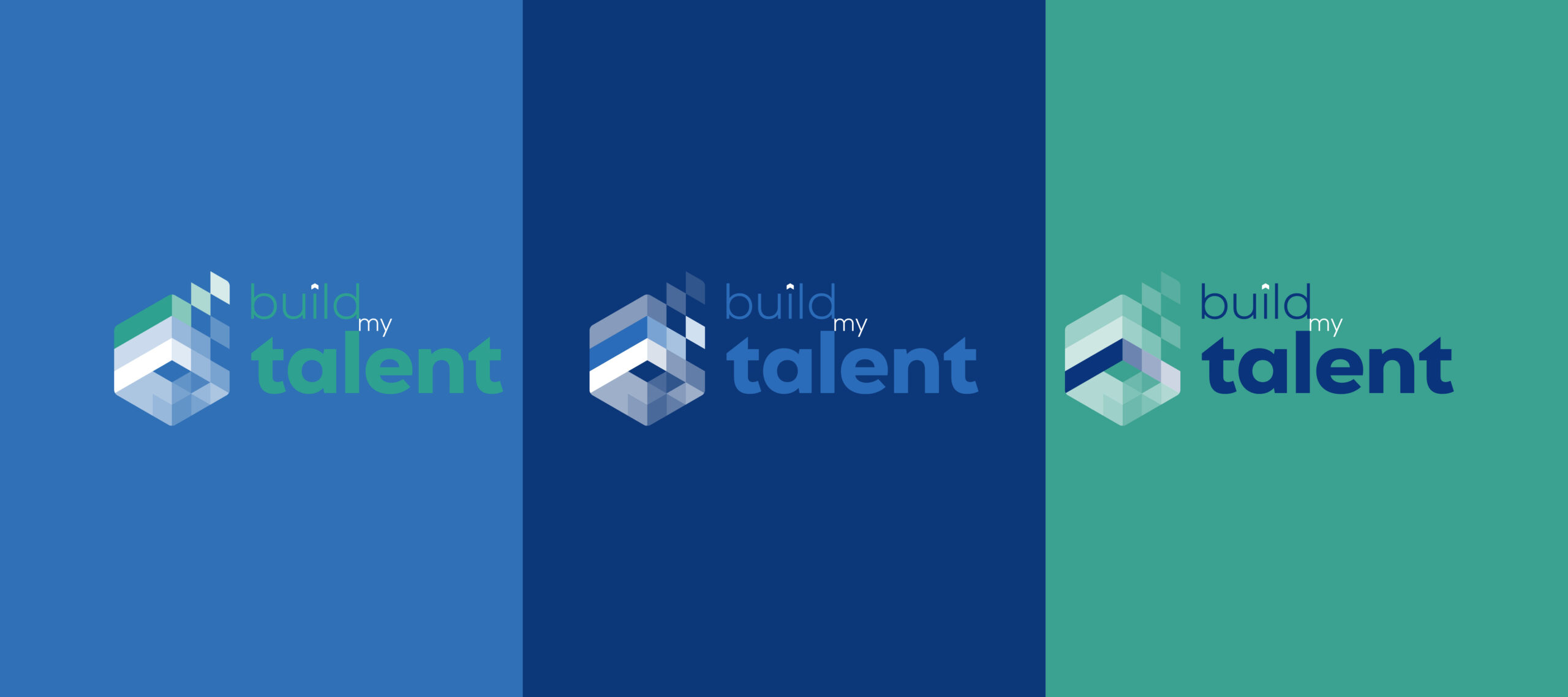
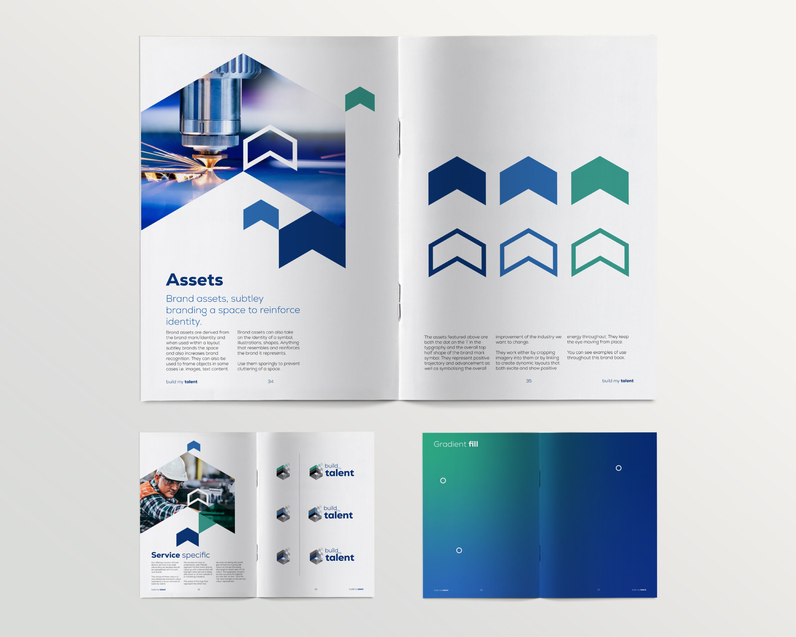
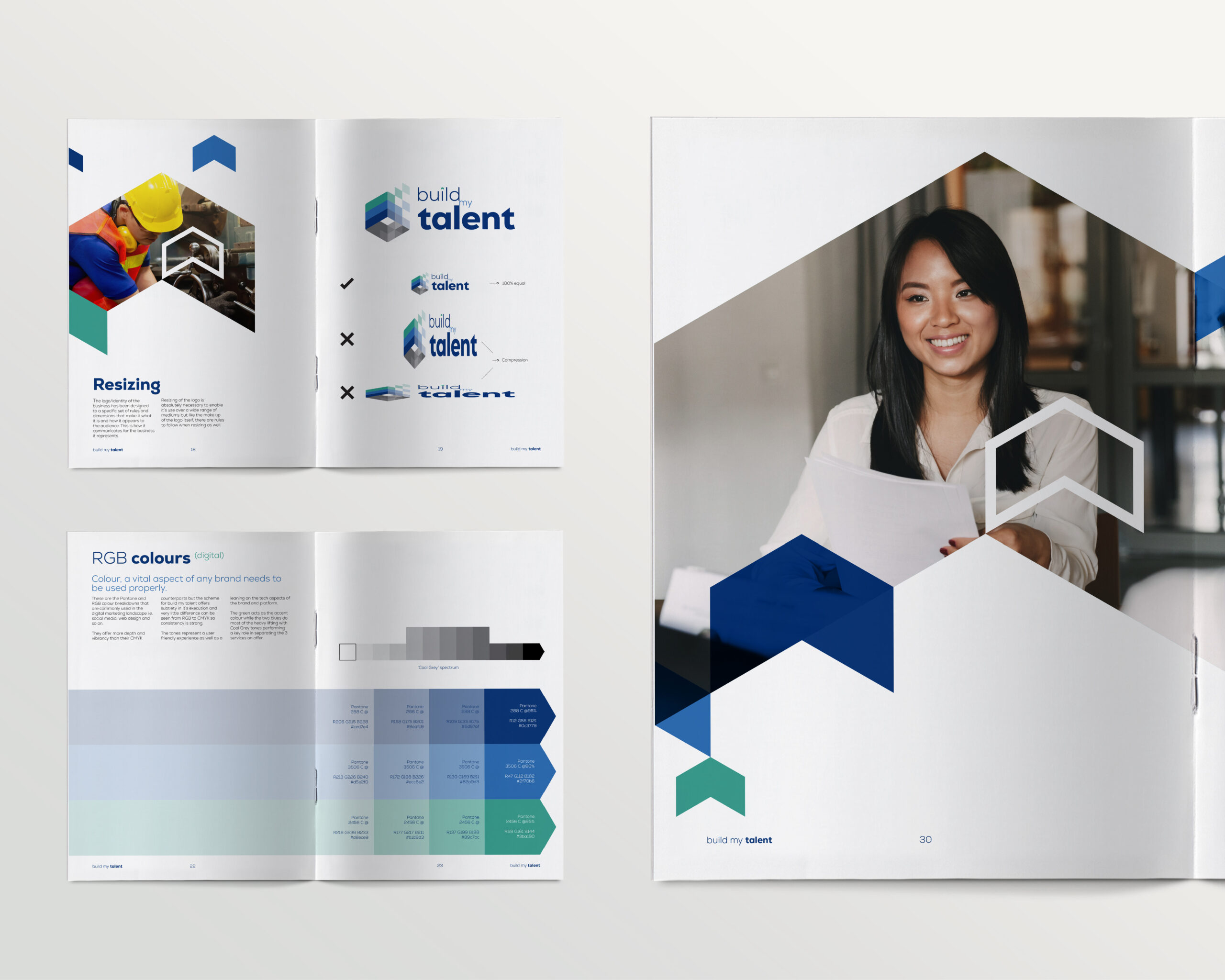
This business required a brand that would be powerful and versatile to take them forward, keeping in mind the new sectors and growth plans they have and to offer the versatility to market how they would like, without barriers. To create a brand that is modern, clean, but uses subtle brand devices to help clients navigate the platform and BMT’s multitude of services to help obtain the skills they need to enable them to build their new career!

Branding
  • Branding
  • Logo design
  • Brand guidelines
  • Advertising
Primary colour scheme
Negative colour scheme #1
Negative colour scheme #2
Negative colour scheme #3
Black and white
White and black
Primary line drawn secondary form
There are a number of devices in the symbol. The first is an upward arrow representing the upward trajectory of a client’s career path.
Next is the step by step approach they take while growing and elevating themselves.
Next the three sub brand elements that will make the BMT platform successful.
Finally the building blocks/skills shortages that BMT use to fill the holes in their client’s businesses with to help them evolve and become more robust and successful.
Example of an advertisement for use in social media. The negative space arrow that crops the image to reinforce the the construction sector audience as well as the positive upward trajectory.
When communicating from one of the sub brand services the logo will change to highlight only the colour/brand colour that represents that sub brand.
Here are the negative colour scheme variations of those.
The brand guidelines both inform the viewer of the use of the logo but of the brand in layout design situations. The brand asset in full use in cropping imagery and balancing with white space.
White space plays a vital role in the success of this brand in use.
All arrow assets used within a layout, will always face upwards.

Get in touch