
Vocacio is Italian for ‘vocation’ a very apt word for their industry. Formerly Lloyd Walsh Recruitment, Vocacio approached us with a clear goal in mind. To completely reinvent their recruitment company.
They have a clear vision, values and a strong ethical and moral focus on environmental issues. They recruit using as much technology as possible in their processes including, performing interviews for candidates and holding meetings and client communications via video conferencing and telecommunications technology. This then limits travel for both employer and candidate to a minimum, therefore making their carbon footprint as small as possible.
Vocacio want to be a pioneer on Green issues within their industry.
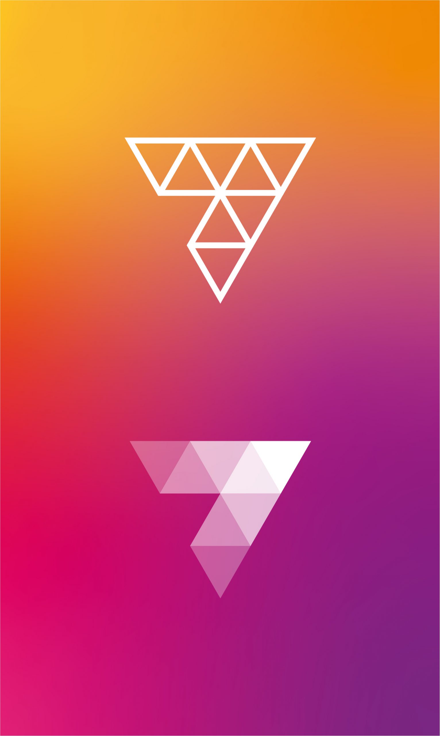
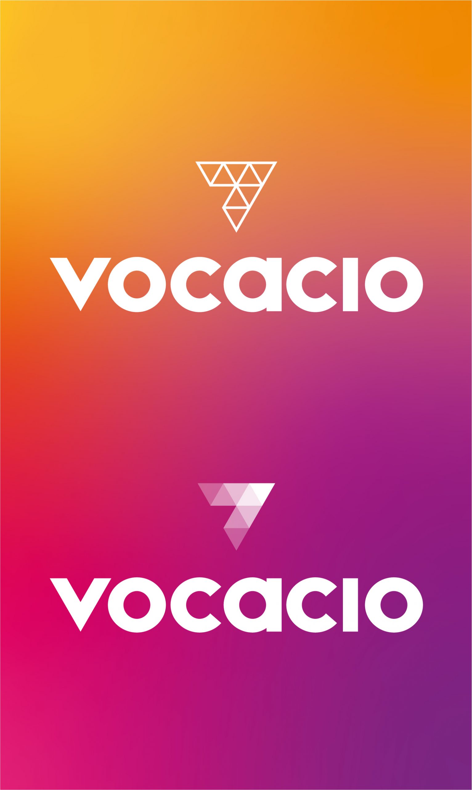
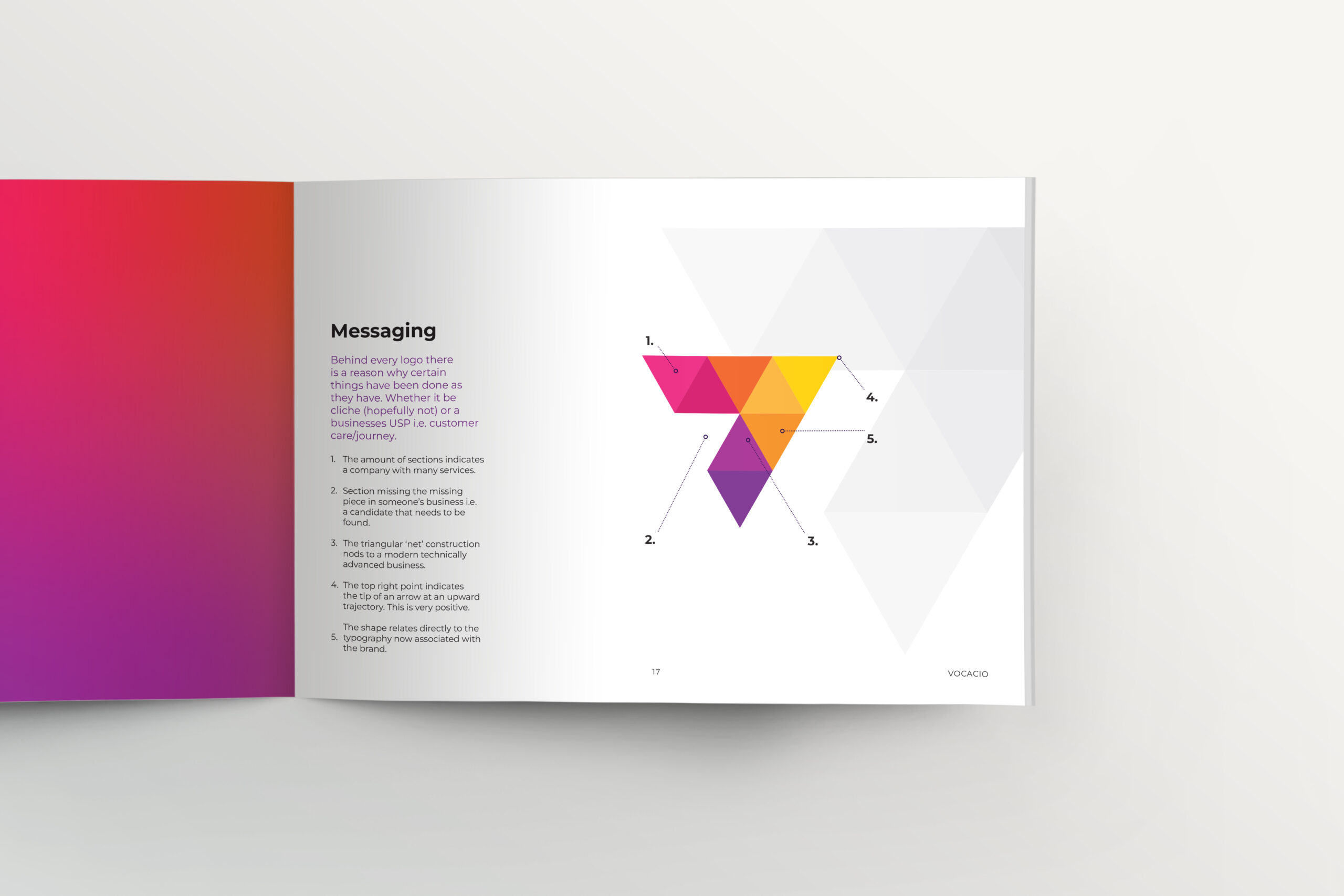
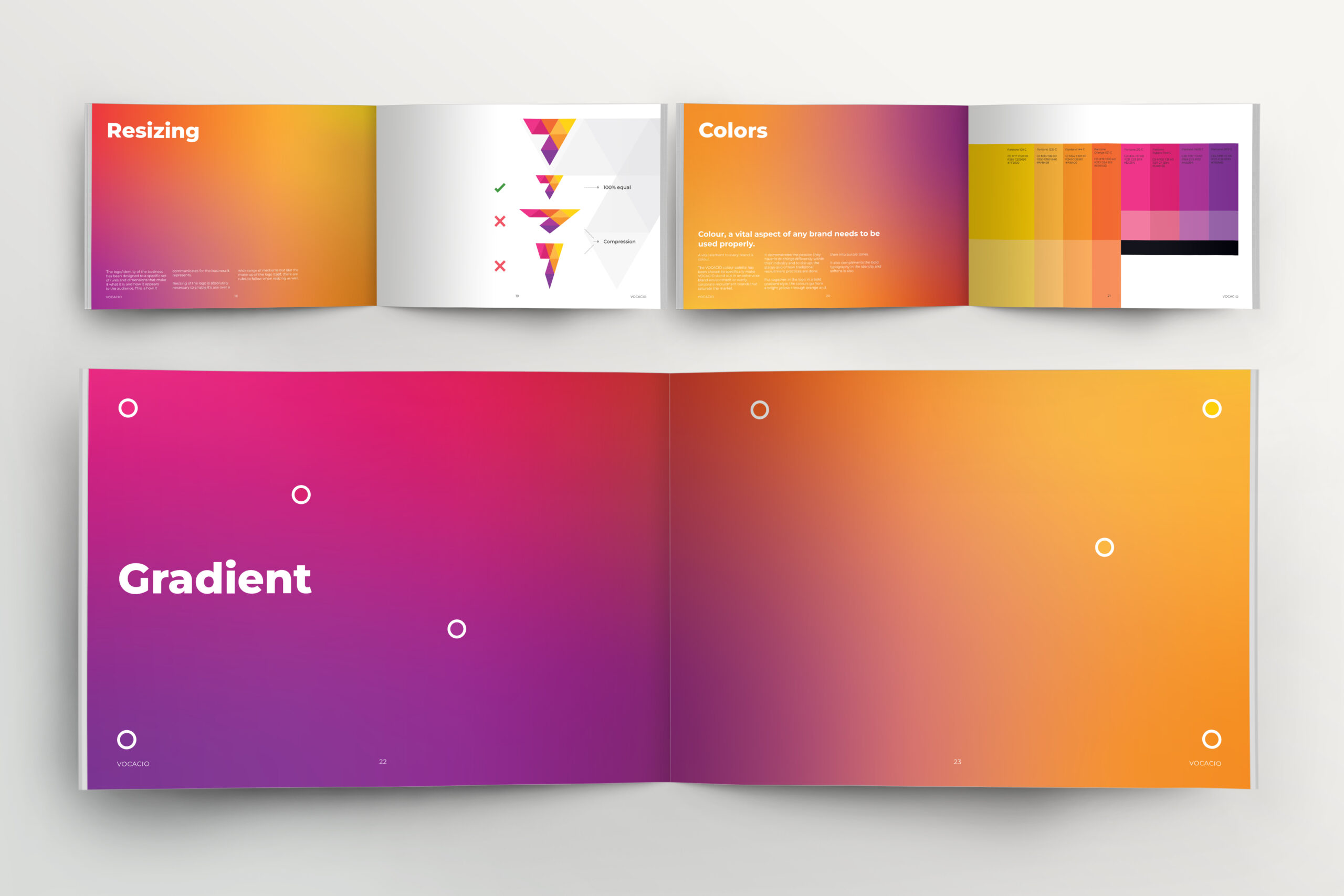
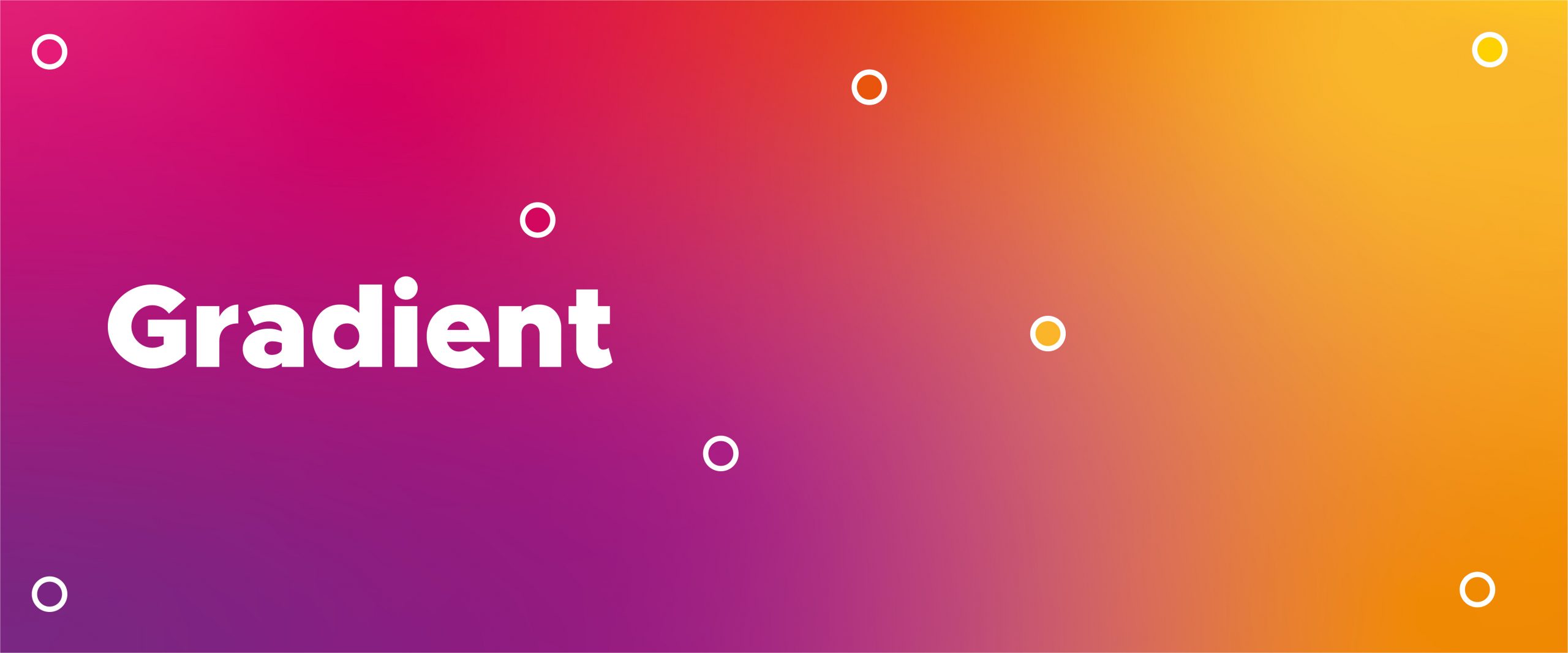
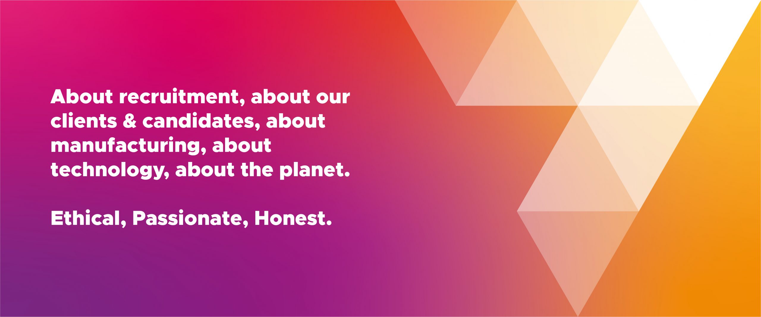
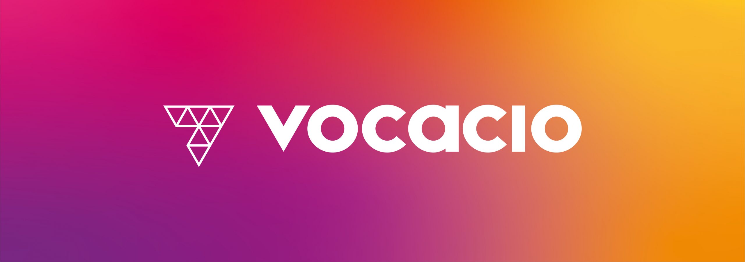
They want to stand out in their industry, which is saturated with ‘safe’ brand visuals and colour use i.e. tones of blue and bland forms. The colour scheme was created to make this happen.
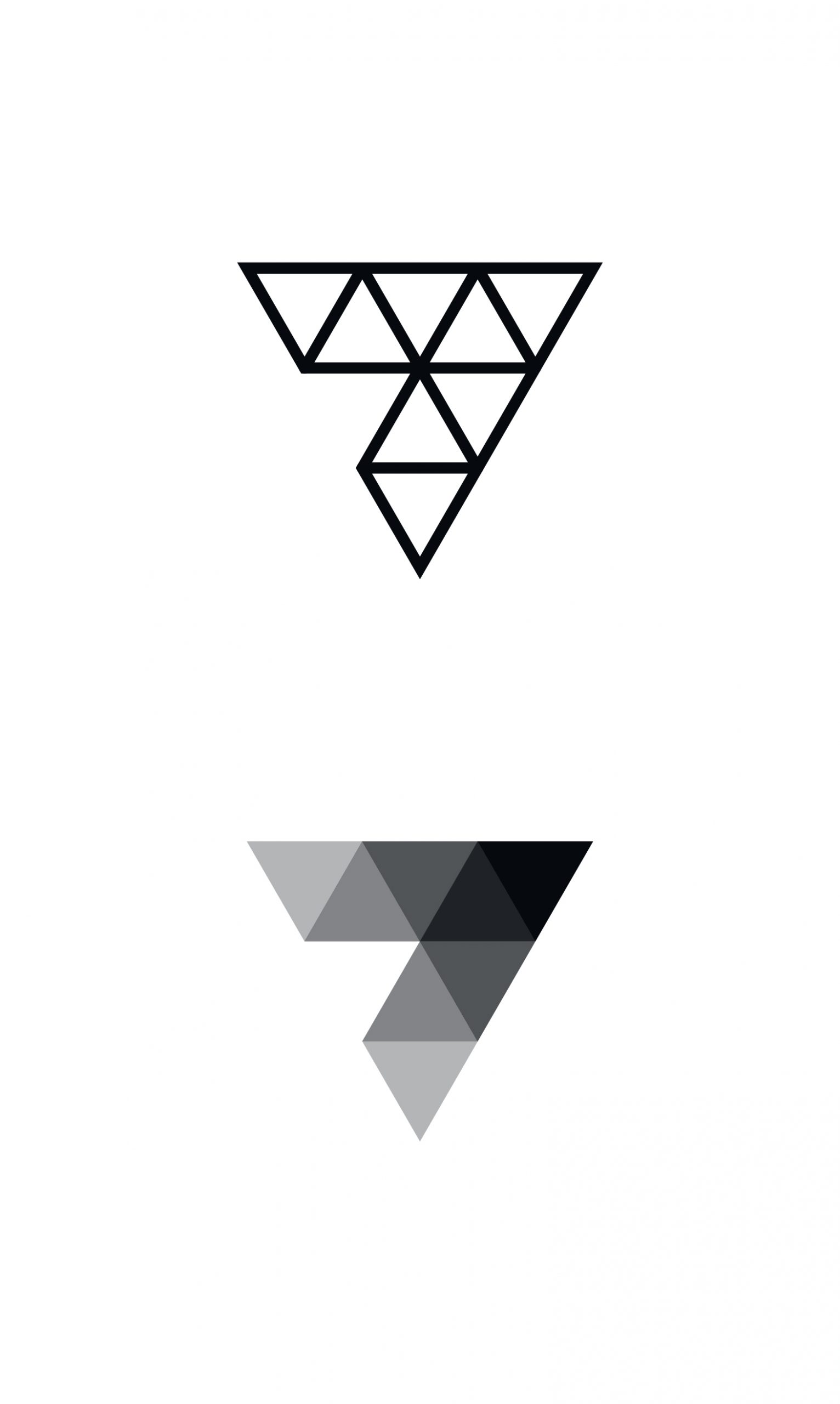
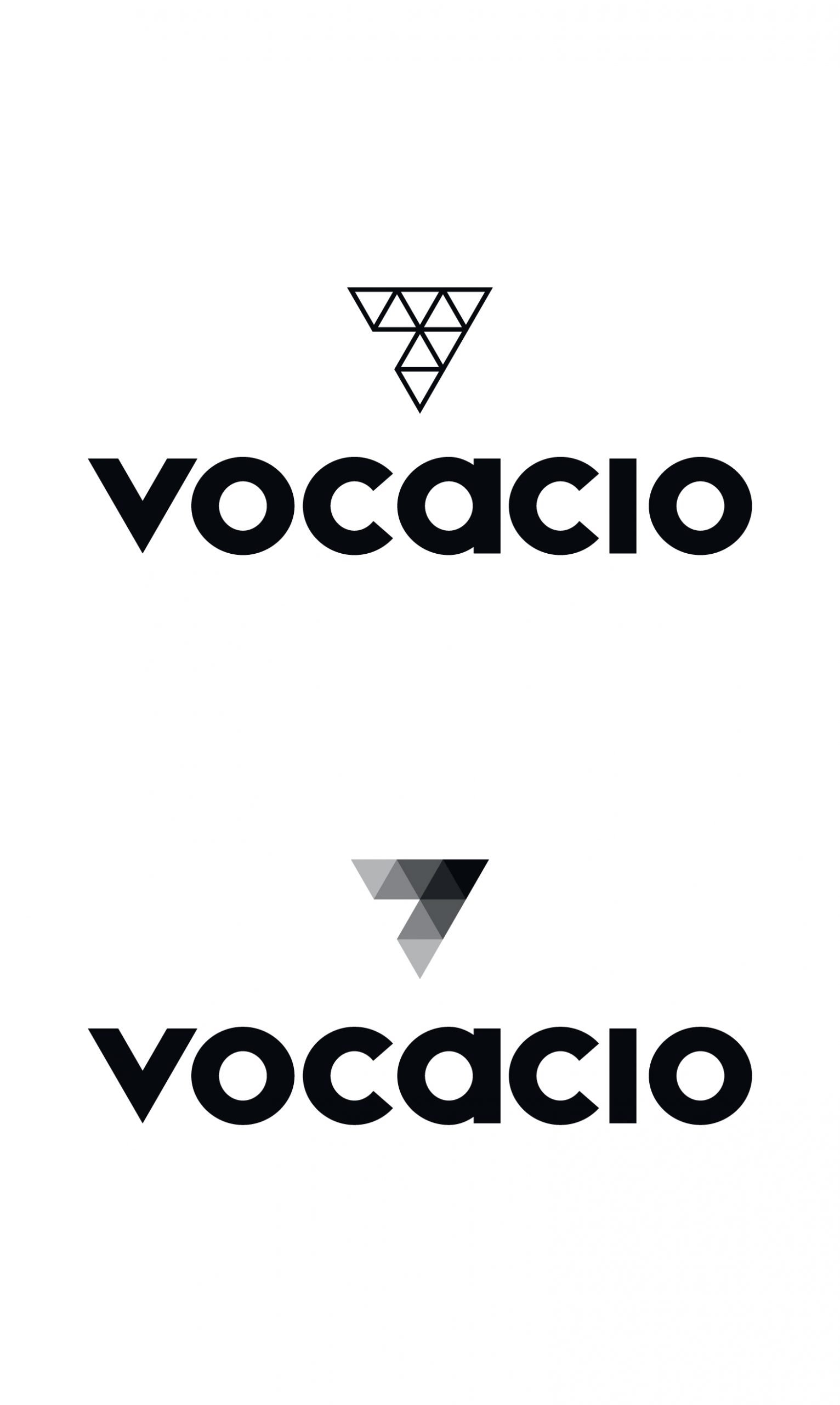
The overall form of the logo needed to be sharp, bold and able to be utilised across a variety of media i.e. social media, signage, web and video so with minimal simplicity at its core the logo has succeeded.
The client is an absolute joy to work with and their values and mission a breath of fresh air.
Branding
- Logo design
- Brand assets
- Brand guidelines