

Grace & Co. are Bristol based Mortgage and Protection Advisors.
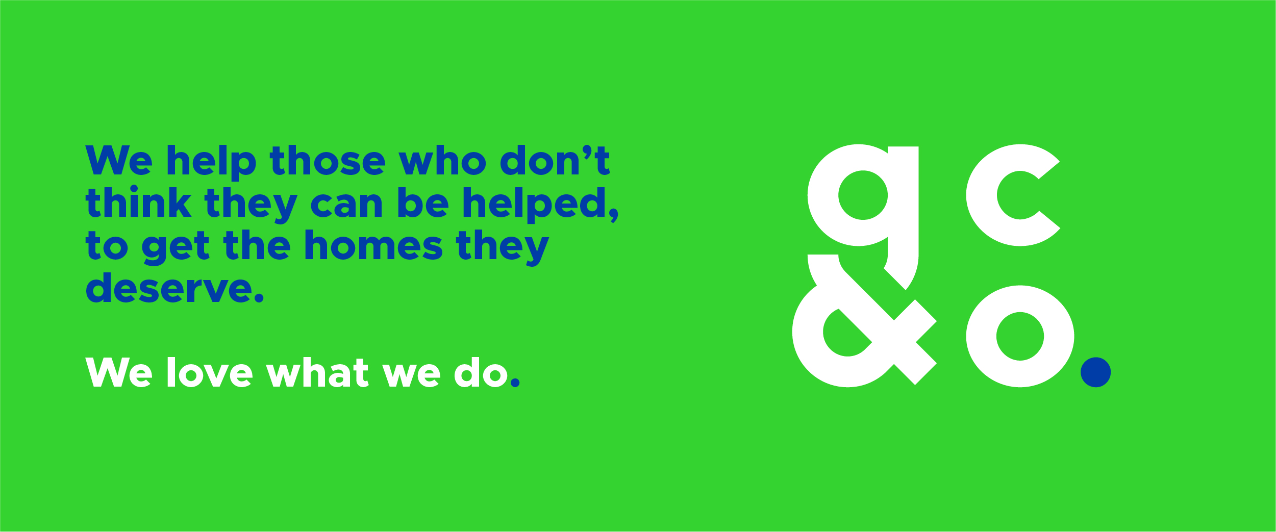
Providing an amazing service and specialising in first time buyer mortgage applications they can help people who believe they cannot be helped, to buy the home they deserve. Full of personality and a friendly personable business, Grace & Co. really do care about their clients and look after them as they embark on the biggest financial commitment of their lives.
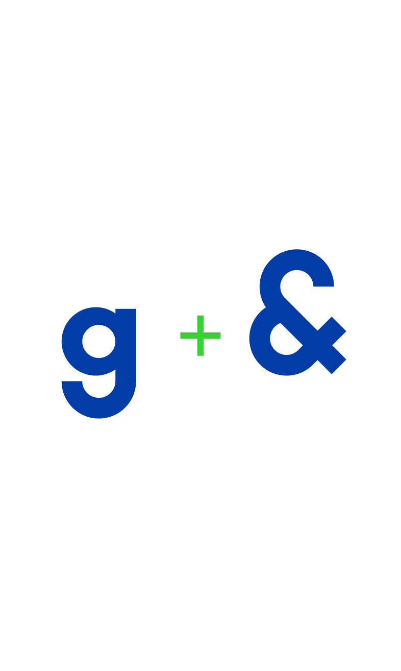
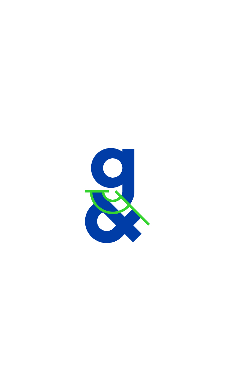
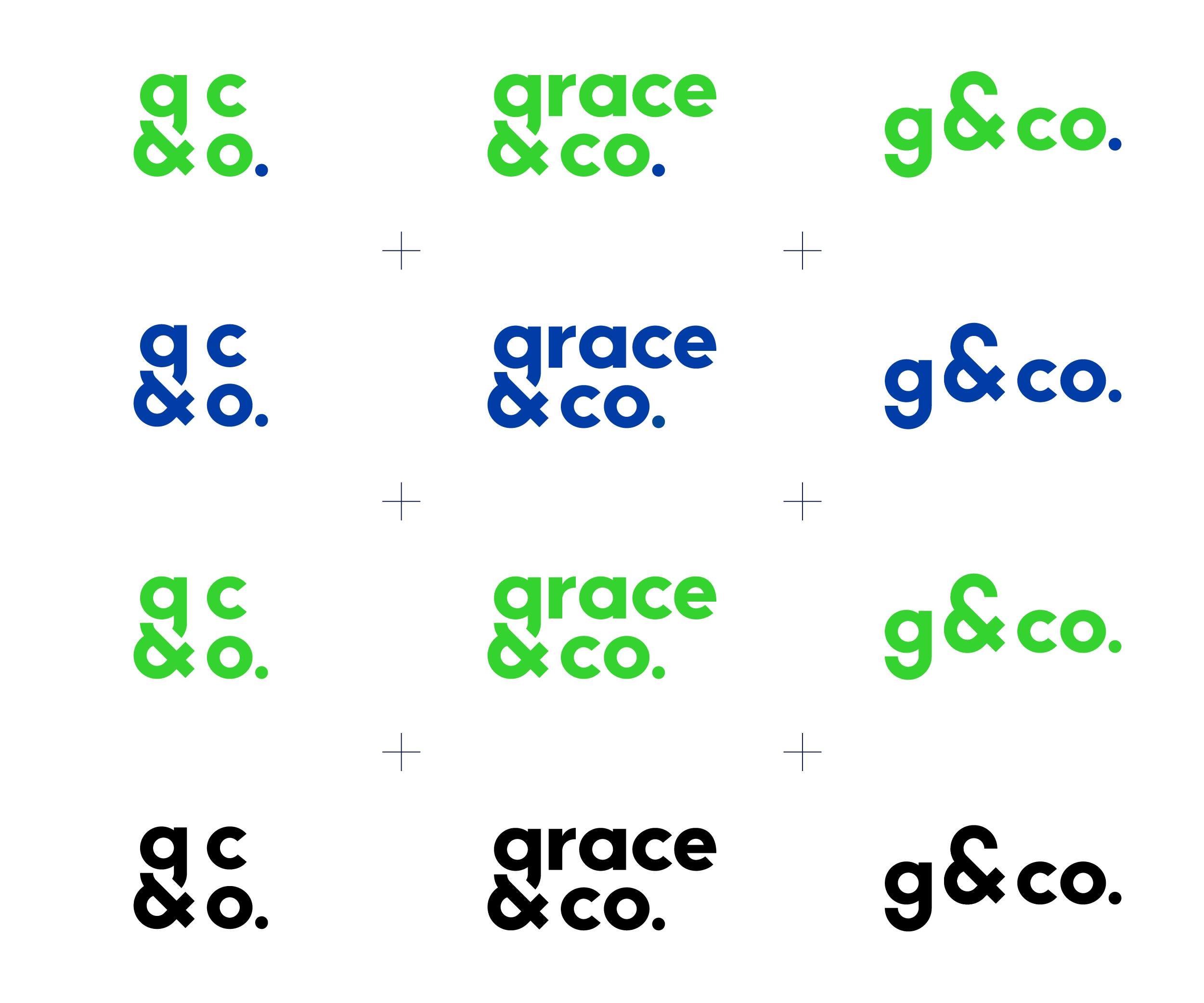
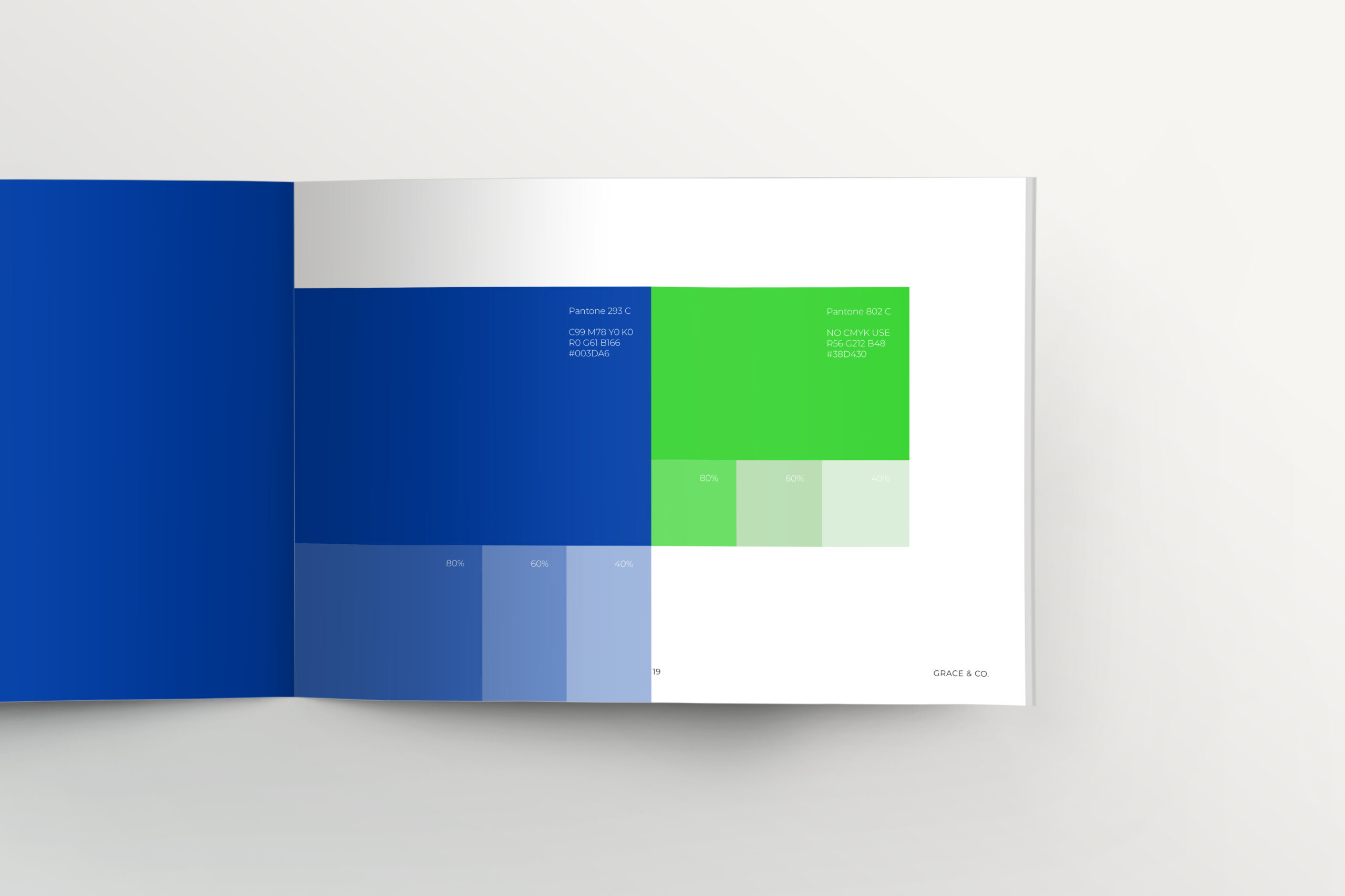
The logo needed to represent these characteristics, values and beliefs as well as looking professional. The colour really does make them stand out!
Branding
- Logo design
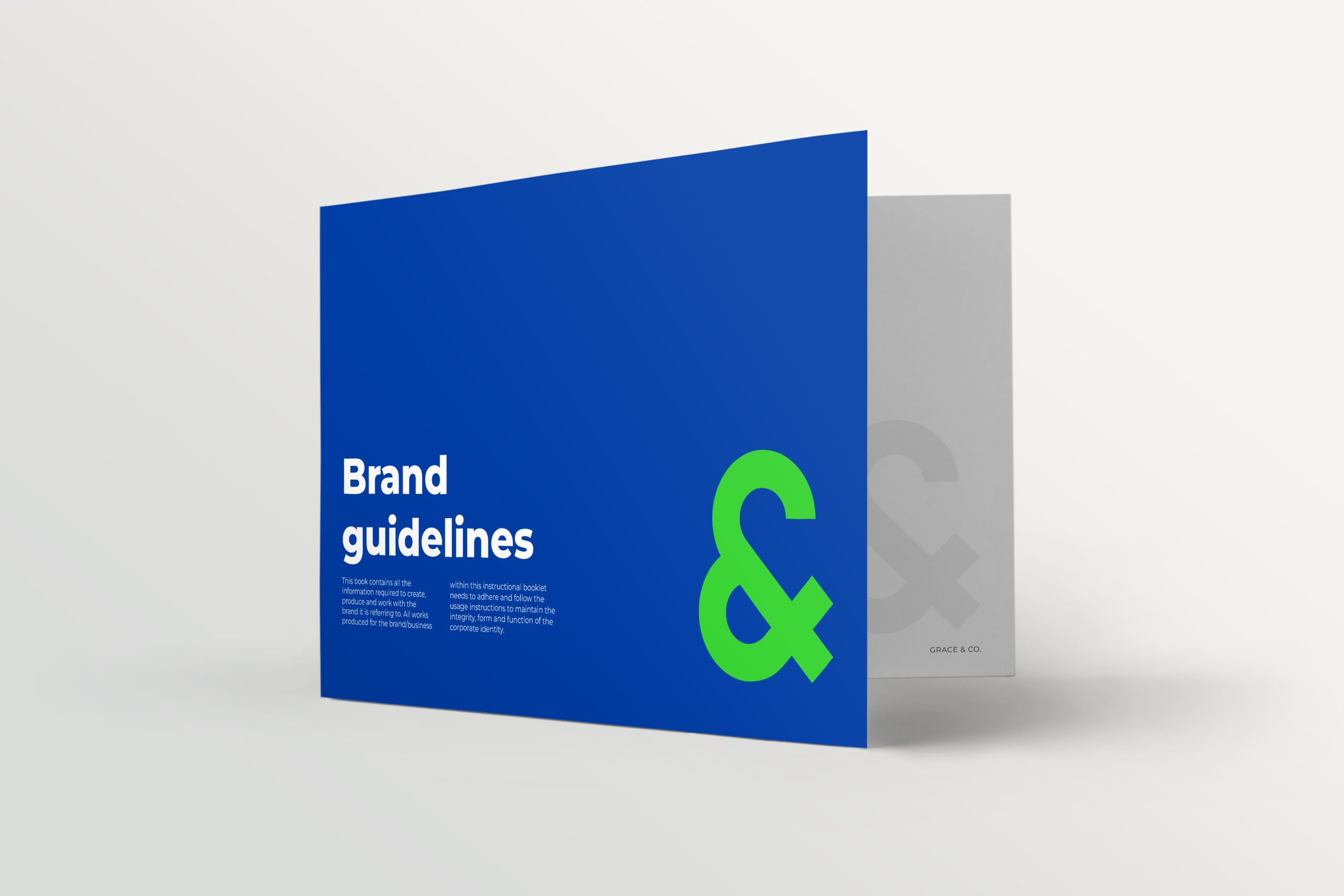
- Brand guidelines